Microsoft Teams
Improving productivity
DESIGNING THE EARLY VERSION FOR MICROSOFT TEAMS
2017 - 2018
Role
Lead Designer
Project Scoping
Tools
Design: Sketch, Powerpoint
Analytics: Custom analytics
Collaborators:
1 x Design lead
2 x Product lead
1 x Engineering lead
~3 x Leadership team
1 x Style guide collaborator
1 x User researcher
Customers:
B2B Office 365 users
THE CHALLENGE
Designing for quick access using Slash command and improving productivity
Microsoft Teams is a chat-based application for better collaboration in the workplace. It’s part of the Office 365 suite. It was released in March 2017.
Slash command was introduced to help tech-savvy users or keyboard users quickly perform tasks or navigate within Teams. The Slash feature along with a suite of other features helped address the business need of 329000 organizations and tripled the DAU metrics (September 2018).
ROLES AND RESPONSIBILITIES
I was part of the founding team in the newly-formed Bangalore office in August 2017 and collaborated with PMs and engineers in a distributed team to map out the scope of the feature along with executing the designs end-to-end.
DESIGN CONSTRAINTS
1
Our goal was to help users use Slash without remembering complicated shortcuts.
2
The app lacked a customer support page and had no onboarding flows for complex features
3
The app also lacked in-app notifications to announce new feature release.
RESULTS
The Slash feature was part of a bundle of productivity and integration features that addressed the business need of 329000 organizations (as of September 2018) and tripled the DAU metrics.
1.
Research
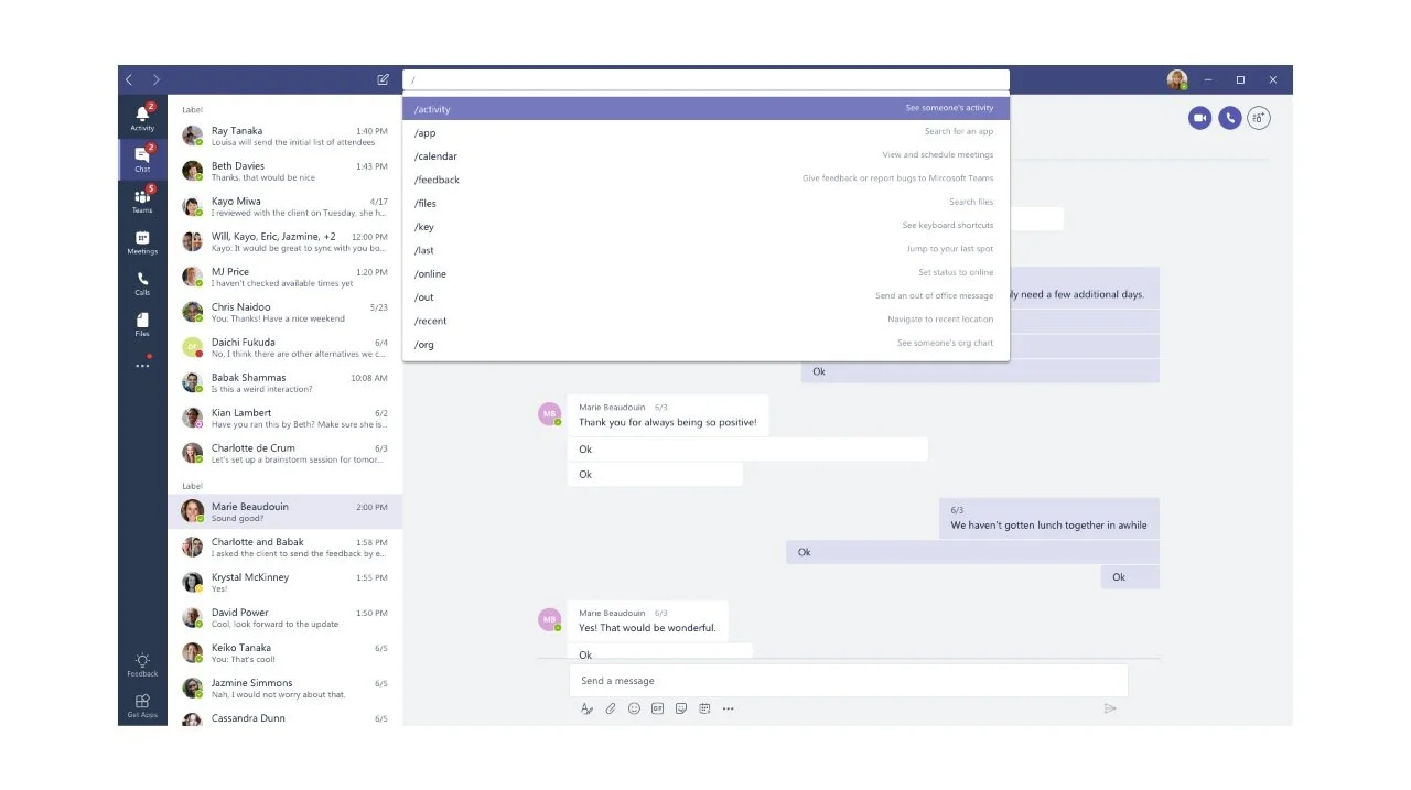
Slash is a productivity feature that allows users to access other apps and tasks inside Microsoft Teams without navigating away from the tasks at hand.
Designing Slash involved understanding the scope of different apps that Teams supported, prioritising apps that are frequently used and brainstorming on ways such that Slash is easy to use.
I worked with the product lead and user research team to understand the existing challenges the early adopters had experienced. A few recurring issues were a non-existent one-stop support page, a lack of WCAG-compliant features and new users not using apps hidden in the menu.
USER TYPE
Microsoft Team is targeted towards bigger organizations.
Existing Office users: These made up the bulk of our initial user base.
Previous Slack users: We also had organizations who were switching from Slack to Teams and wanted features that the employees could easily adapt to. Slash was one such feature.
TASK PRIORITIZATION
Based on the type of tasks that users did most, the initial release was aimed to improve searching files and @users.
2.
Planning
DISCOVERABILITY
Microsoft Teams’ biggest challenge at the time was discoverability. It had two issues:
Hidden apps due to lack of space (Image below): The default desktop design was centred on the Chat interface. As the number of apps exploded, the interface lacked the design to scale. This resulted in a ton of apps getting hidden inside the menu.
Admin-prioritised apps: The apps that show on the left panel are the ones that the org admin has prioritised even though each team and user may frequently use other apps that are available a click deeper.
Our goal was to make sure that existing Office 365 users can discover and use the app as efficiently as a Slack power user.
To improve the discoverability and ease of use of the Slash feature, we introduced placeholder text in the Search bar and avoided complicated abbreviations that only power users would know. To ensure easy usage, we limited the commands’ combination to 3.

3.
WCAG - Compliance
KEYBOARD ACCESSIBILITY USING SHIFT + F10
Challenges of accessing “hidden buttons” using the keyboard
As seen in the above image, the Teams app included a few hover state buttons. So we were concerned about the best way to access them using the keyboard. While the intent was to give users a faster way to manipulate files using the mouse in the list view itself, the same task gets extremely time-consuming on the keyboard. So to ensure a consistent experience, we decided to limit the number of hidden buttons to 3 and only focus on tasks that are frequently performed.
Below is a walkthrough of the screens using a keyboard.